Periods for Periods
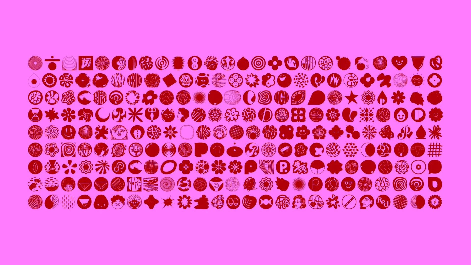
IllustrationWith COVID-19 interrupting supply chains and making period poverty worse, this was the perfect time to take action, drive conversation, and put pressure on officials to finally do what’s right. And this is exactly what Rethink Canada did when they set about creating the first font made entirely out of periods. It was created to protest the cost of menstruation products in North American schools, and they did so by teaming up with over 140 international designers from around the world.
So when they approached my about taking part in this taboo-breaking project, I couldn’t say no. The brief was open and simple: my period design had to have a 1:1 ratio so as to fit in amongst the other periods, and I could design my period however way I wanted to.
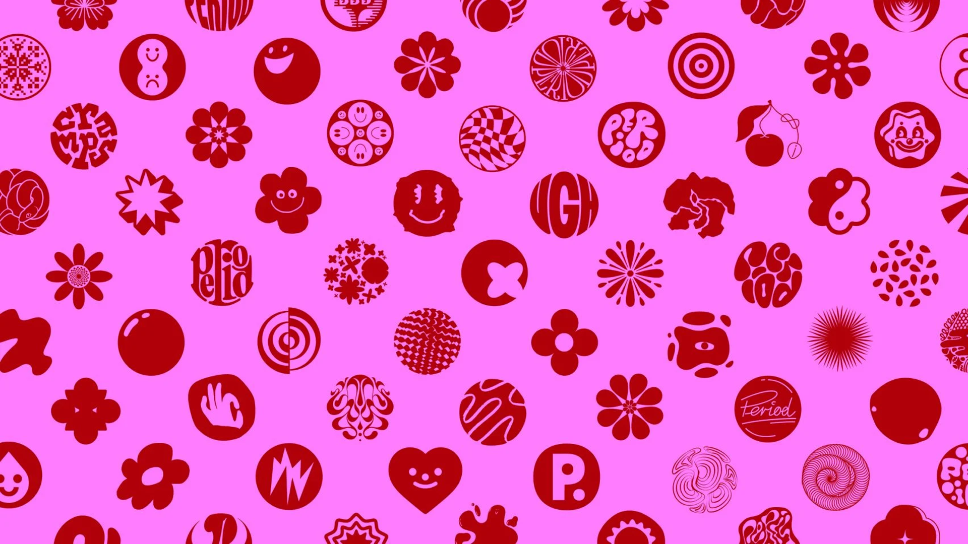
The thinking behind the period I designed came from both an emotional and physical perspective. The faces symbolises the wave of emotions that come the weeks before your period, and the 8-like shape they’re in represents the shape of period pads.